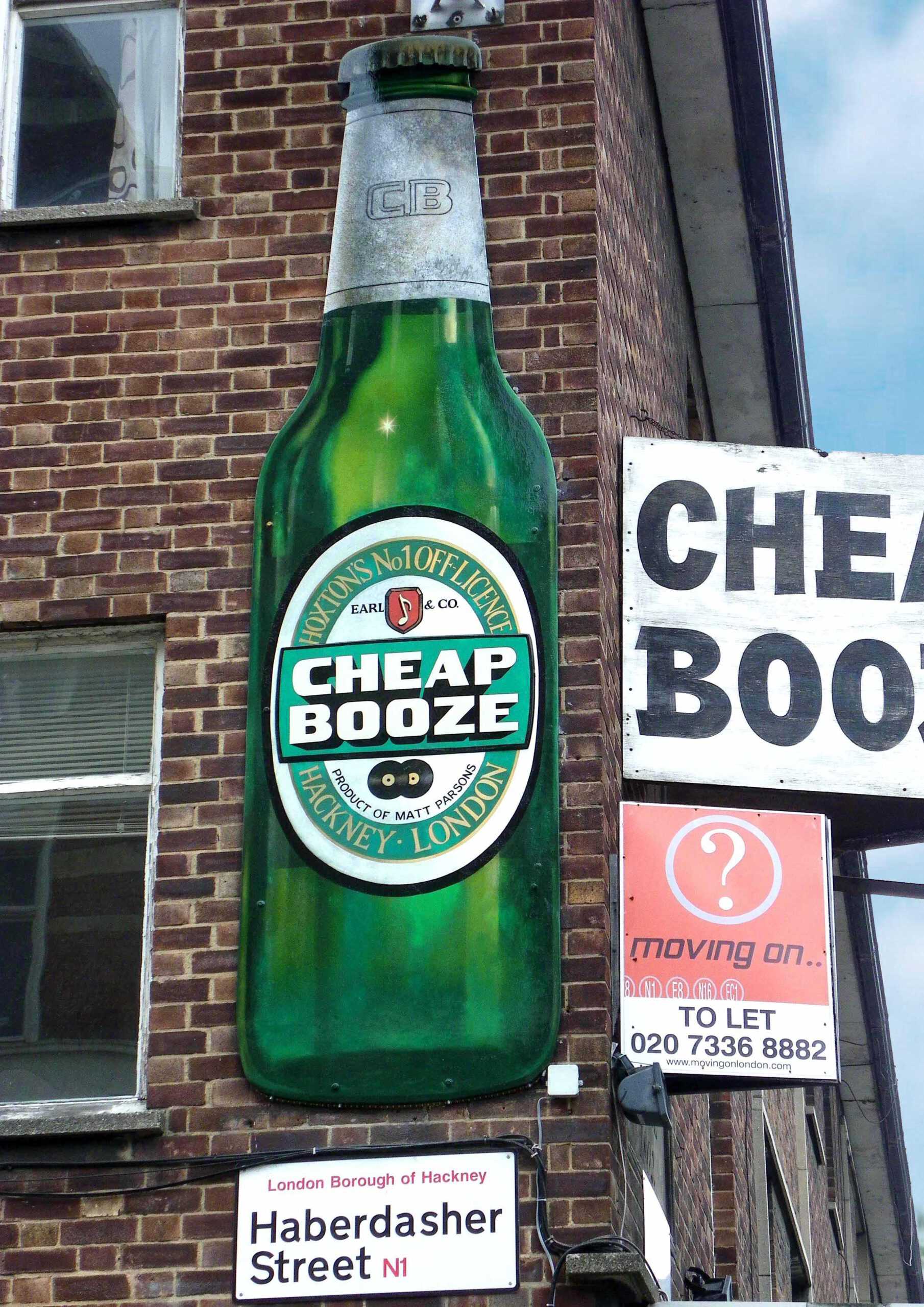
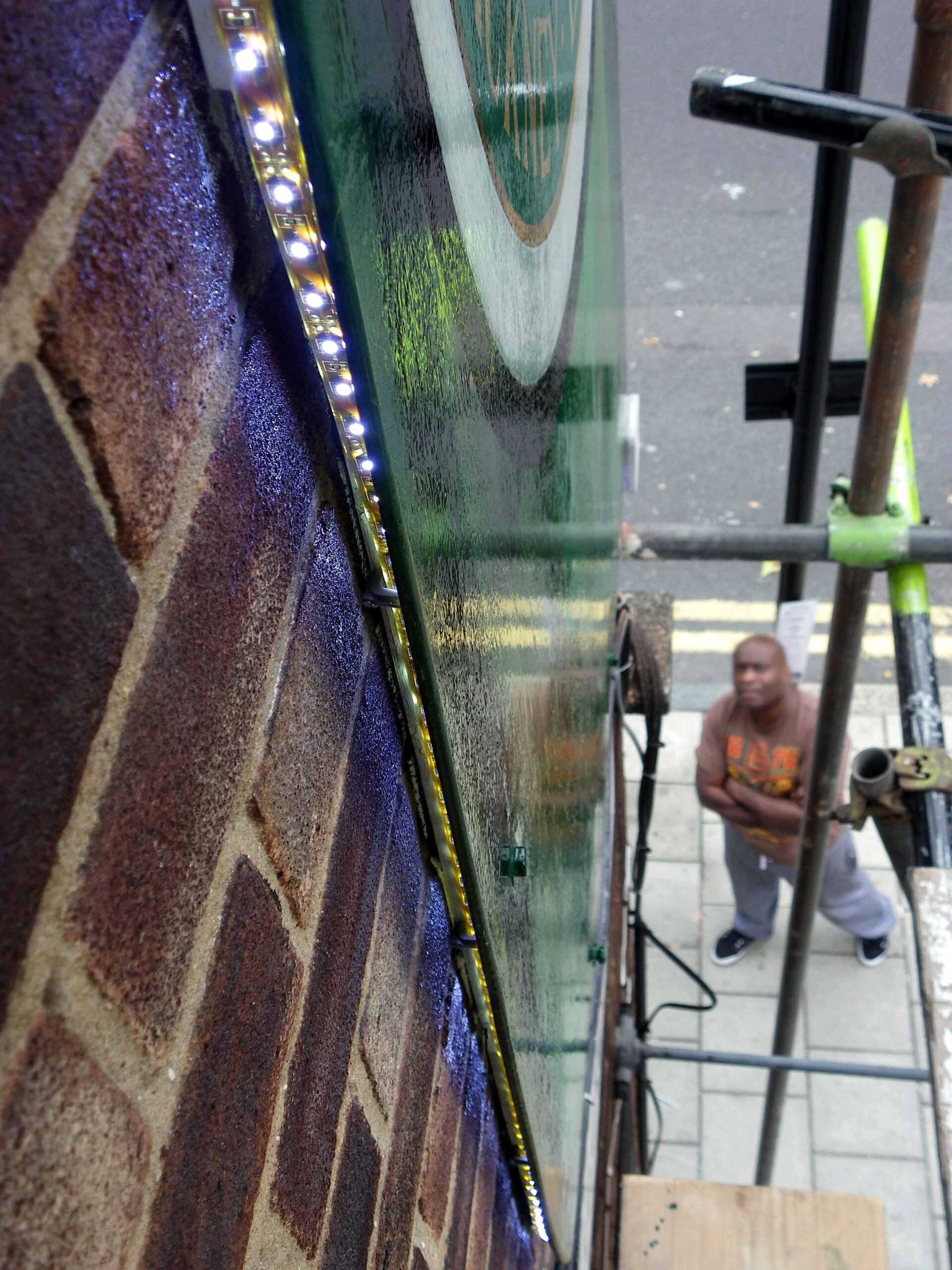
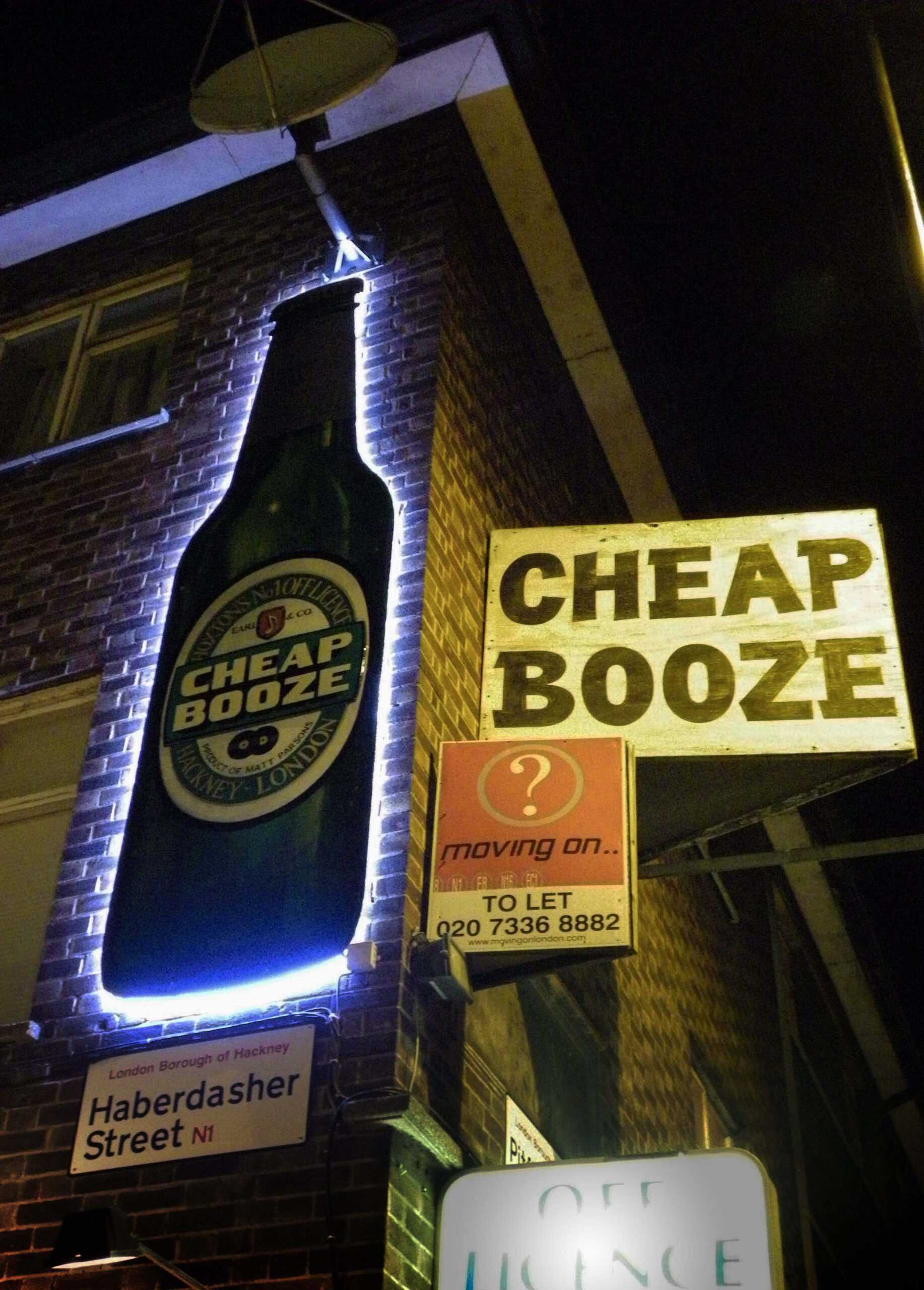
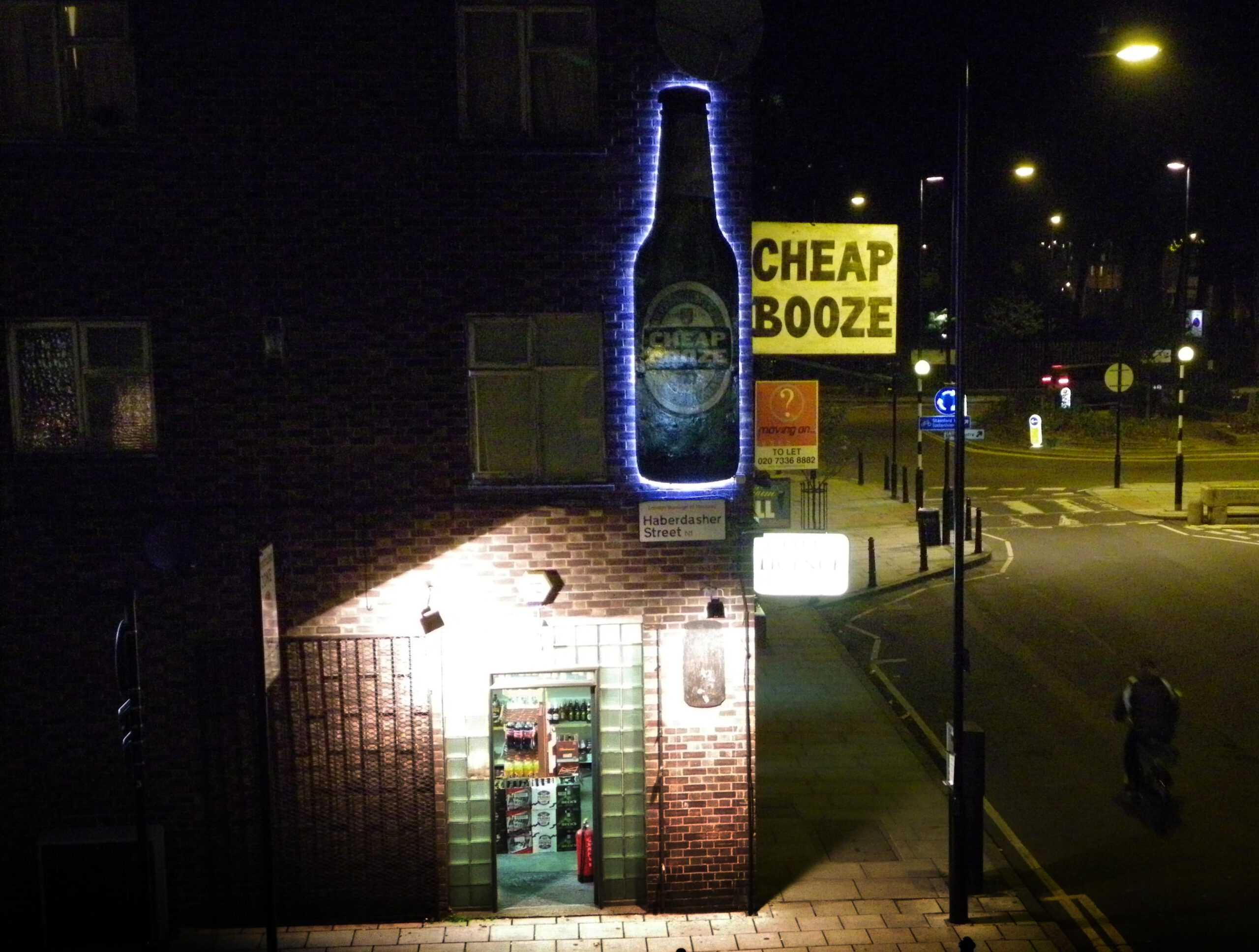
The Painted Bottle
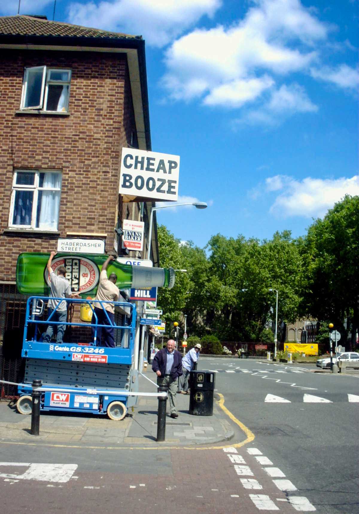
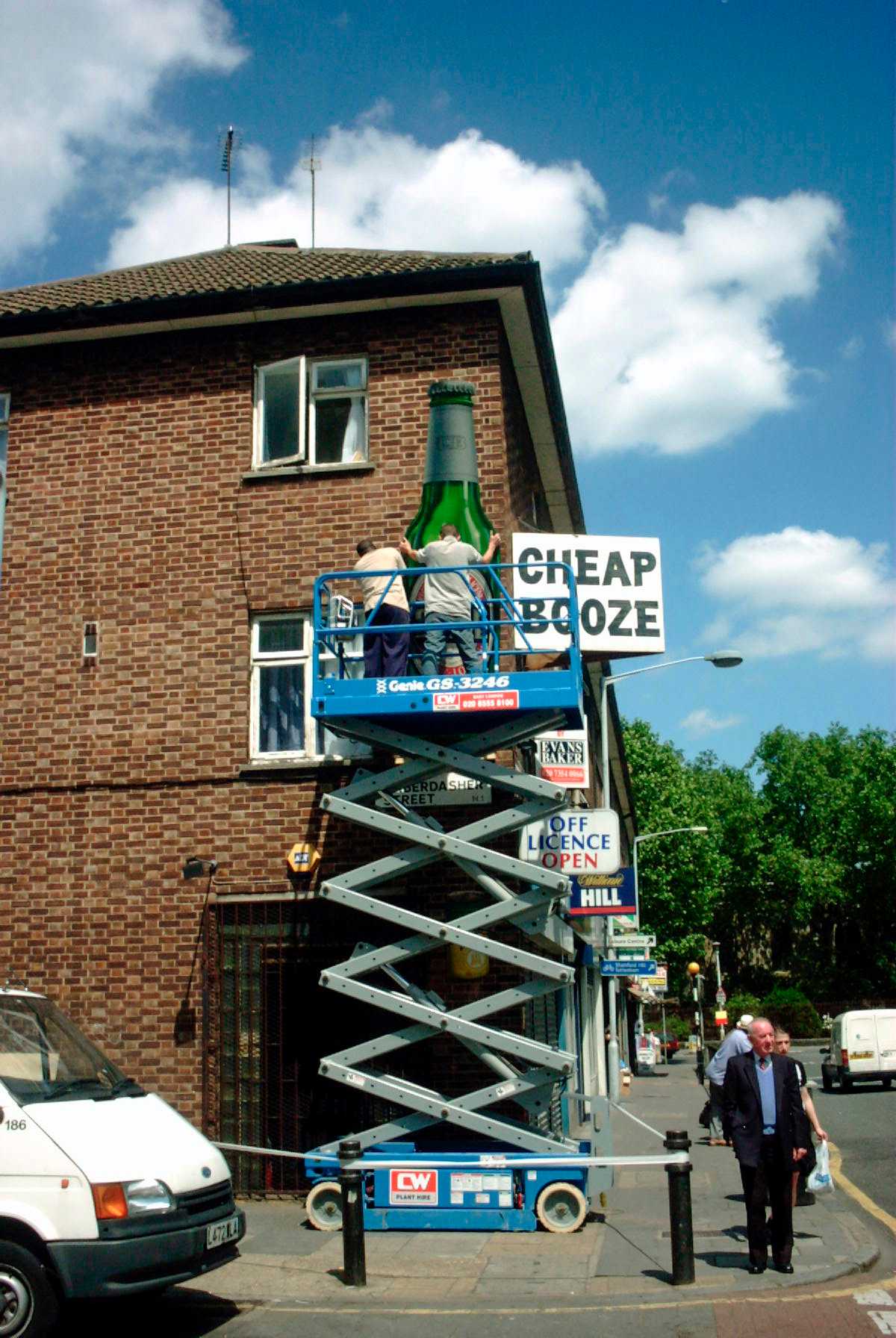
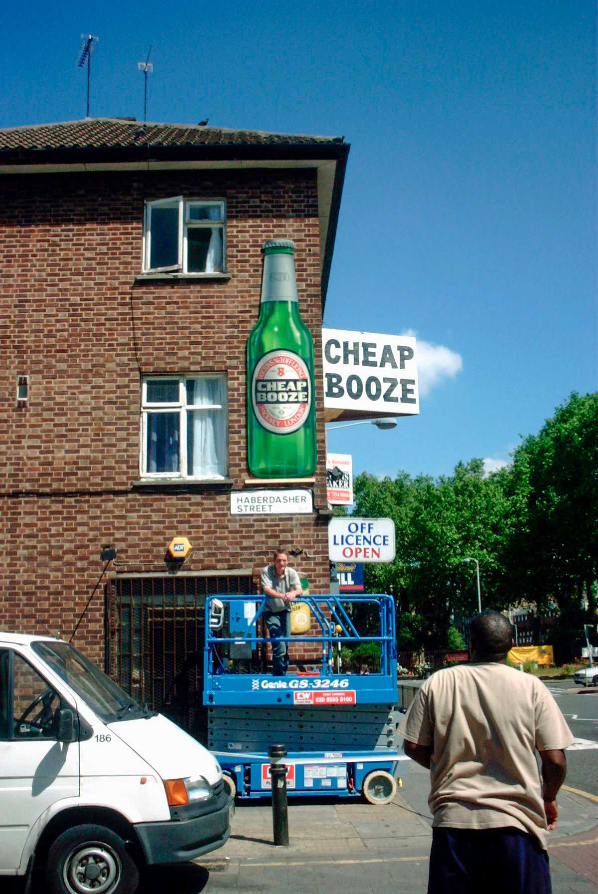
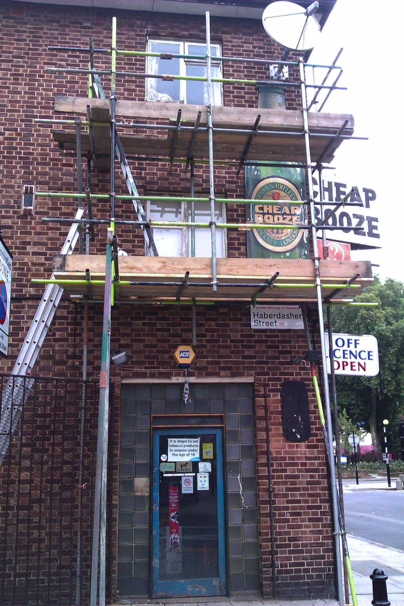
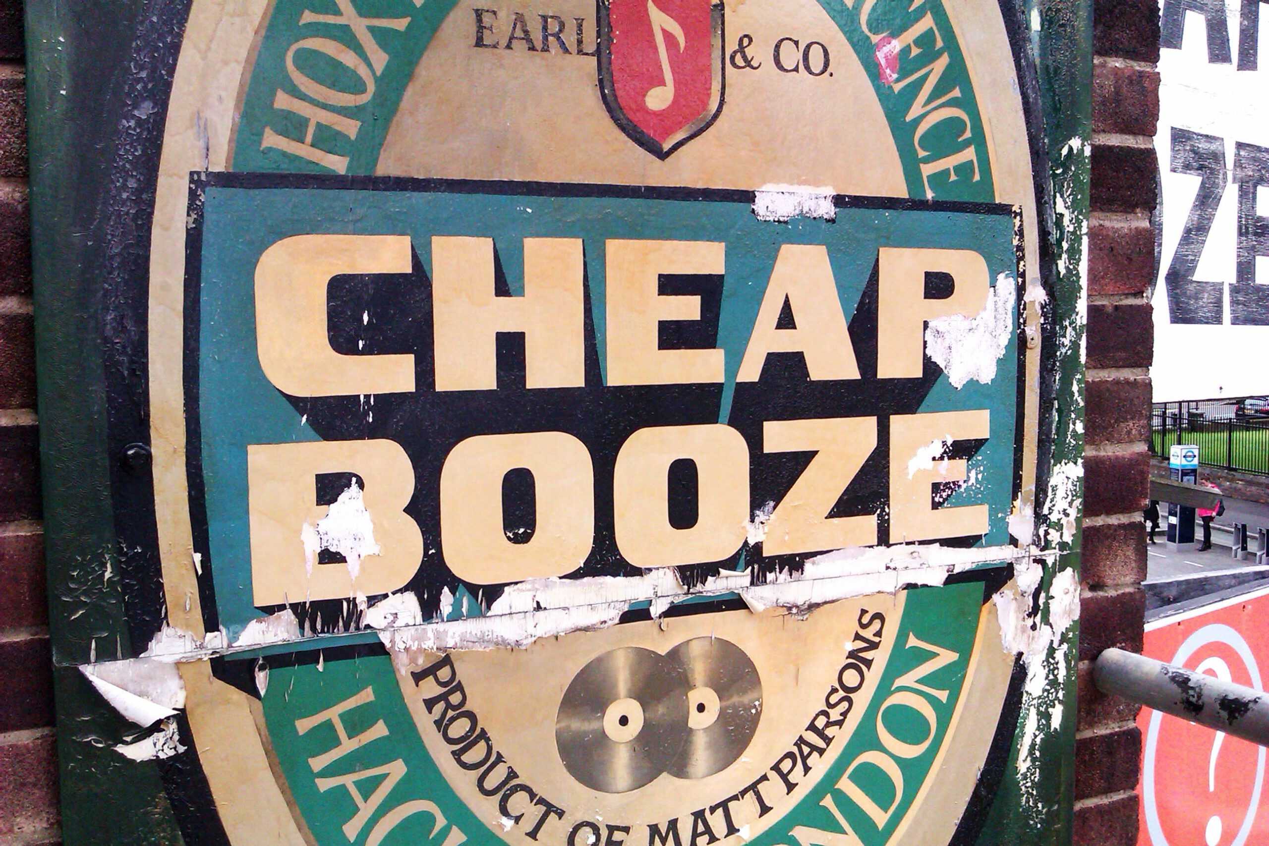
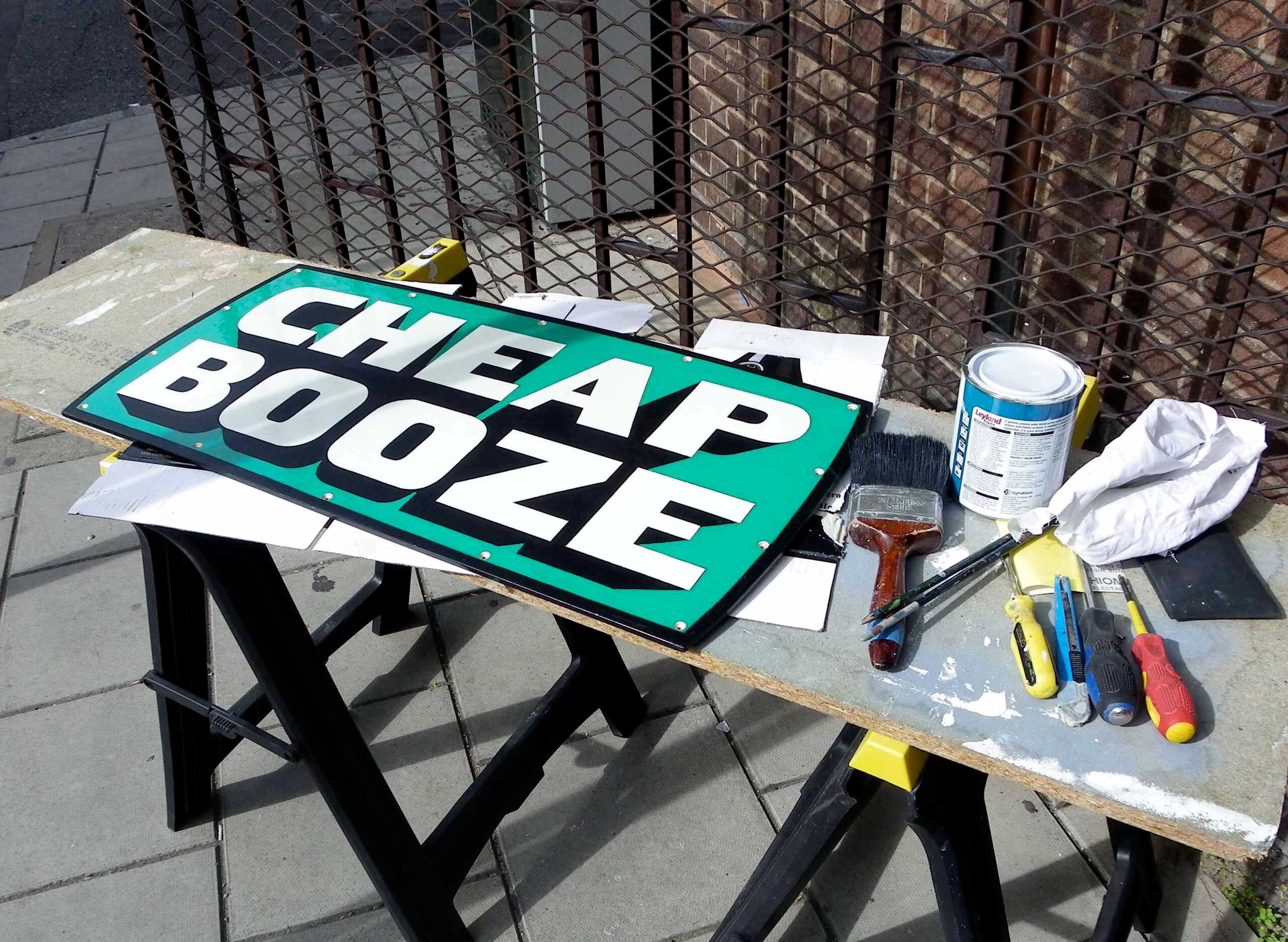
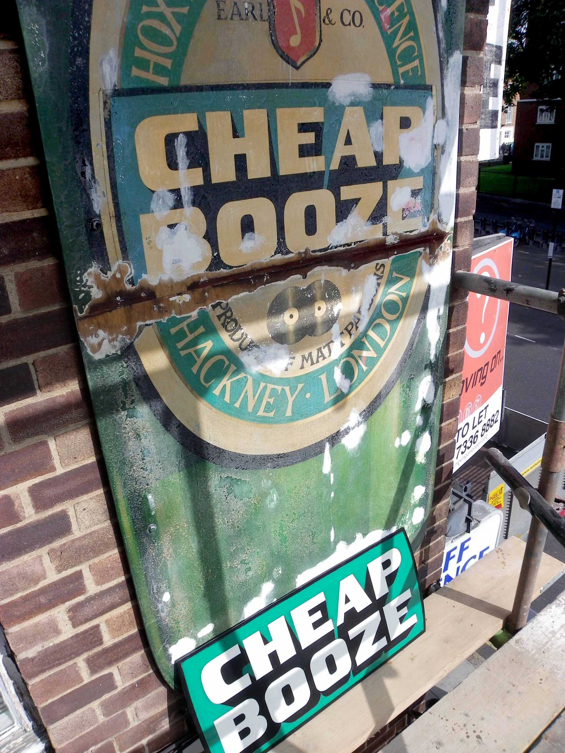
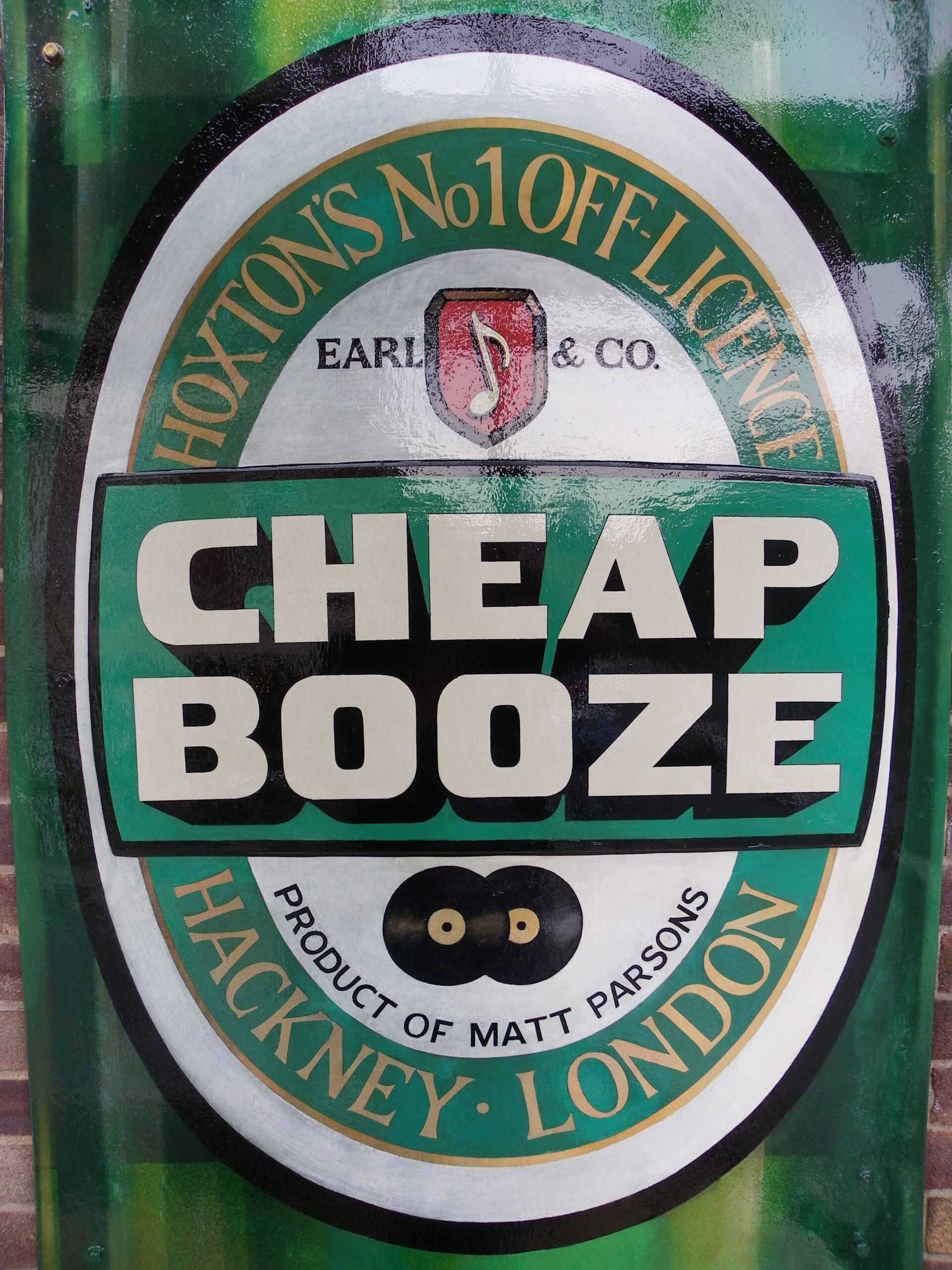
It was the original ‘Cheap Booze’ sign, painted by a jobbing Signwriter on two large adjoining panels and mounted up high for maximum visibility, that captured the local imagination and in particular that of the hip urbanites.
The no brand, no font, bold brashness of the sign did perfect justice to the no frills name of the enterprise: CHEAP BOOZE.
The knowing use of the words: ‘BOOZE’ coupled together with ‘CHEAP’, both terms not generally employed by the alcohol retail and advertising industries, suggested a certain kind of irreverence towards the tenets of consumption, commerce and capitalism.
